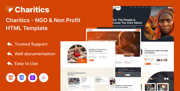
Project Overview
Charitics is a static HTML template designed for NGOs and charitable organizations, featuring complete pages including homepage, donations, events, team, and more. It's suitable for quickly building non-profit organization websites or event landing pages.
Tech Stack
- HTML5 + CSS3 (CSS Custom Properties, Flexbox/Grid Layout)
- Vanilla JavaScript (no framework dependencies)
- Third-party dependencies: Swiper (carousel), Splide (slider), SlimSelect (dropdown), Flatpickr (date picker), MixItUp (filtering), Animate + WOW (animations)
- Fonts: Google Fonts (Manrope / Quicksand / Caveat)
Project Structure
text
chariticshtml-10/
├── documentation/          # Official documentation site (with example screenshots)
│   ├── assets/
│   │   ├── css/
│   │   └── js/
│   └── index.html
└── main-file/              # Official template files (use this directory)
    ├── index.html          # Homepage
    ├── about.html          # About Us
    ├── services.html       # Services
    ├── donations.html      # Donations
    ├── events.html         # Events
    ├── team.html           # Team
    ├── blog.html           # Blog
    ├── contact.html        # Contact
    ├── 404.html
    ├── pricing.html
    ├── faq.html
    └── assets/
        ├── css/style.css   # Main stylesheet
        └── js/main.js      # Interactive logic
Key Files
main-file/index.html— Homepage with complete layout including Banner, donation section, events section, etc.main-file/assets/css/style.css— Main stylesheet defining color variables, responsive containers, animations, etc.main-file/assets/js/main.js— Interactive logic implementing carousels, filtering, mobile menu, search modal, sticky navigation, etc.main-file/donations.html— Donations listing page with project filteringmain-file/events.html— Events listing pagemain-file/contact.html— Contact page
Quick Start
Simply open main-file/index.html in your browser to preview. For development, it's recommended to set up a local HTTP server (e.g., npx serve .) to ensure all page paths work correctly.
Usage Tips
- Color themes are managed through CSS variables in
style.css(e.g.,--ul-primary,--ul-secondary). Modify them in one place to change the global color scheme. - The template uses
clamp()for responsive typography. Adjust spacing and breakpoints as needed to fit your specific content.
