Project Introduction
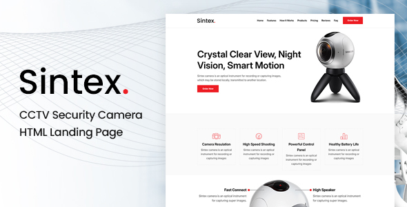
Sintex is a single-page product landing page template designed for camera/security products. It provides complete sections including Hero, feature showcase, product display, user reviews, FAQ, etc. Built on Bootstrap's responsive layout, it's suitable for quickly building product marketing pages.
Tech Stack
- Bootstrap 5 (CSS framework)
- jQuery (DOM interaction)
- Owl Carousel (carousel component)
- SmoothScroll (smooth scrolling)
- SlickNav (mobile menu)
- Font Awesome, Elegant Icons, Themify Icons (icon libraries)
Project Structure
sintexhtml-10/Sintex Main File/
├── Documentation/
│   └── index.html          # Template documentation
└── html/
    ├── index.html          # Main page
    ├── css/
    │   ├── main.css        # Core styles
    │   ├── bootstrap.min.css
    │   ├── responsive.css  # Responsive breakpoints
    │   └── owl.carousel.css
    ├── fonts/              # Icon font files
    ├── img/                # Image assets
    └── js/
        └── main.js         # Interaction logic
Core File Description
html/index.html— Single-page main structure, contains all sectionshtml/css/main.css— Core styles and layout definitions, includes CSS variables and utility classeshtml/js/main.js— Interactions like sticky navigation, product/review/sponsor carousels, smooth scrollinghtml/css/responsive.css— Media query responsive ruleshtml/css/owl.carousel.css— Carousel component style support
Quick Start
Simply open html/index.html in your browser to preview the complete page. For local development, it's recommended to use the VS Code Live Server extension or run npx serve html/ to start a static server.
Usage Suggestions
This template uses a modular structure. It's recommended to replace image assets in the img/ directory as needed. Modify color values like #ed1d24 in main.css to quickly adapt to your brand colors. The mobile menu is automatically generated by SlickNav with no additional configuration required.
